
CSS · 前端 / 样式 / 效率

CSS 常用技巧

CSS 是一门看似简单实则深奥的语言。掌握这些实用技巧,让你的样式代码更优雅、更高效、更强大——从入门到精通的 26 个实用技巧。

26个实用技巧 6大分类 5类现代特性

布局技巧

01

Flexbox 完美居中

使用 Flexbox 的三行代码实现水平垂直居中,告别古老的 margin:auto + position 方案。

.center { display: flex; align-items: center; justify-content: center; }
02

Grid Holy Grail 布局

使用 CSS Grid 实现经典的"圣杯布局":页眉、页脚、三栏内容,中间自适应。比 Flexbox 更简洁。

.layout { display: grid; grid-template: "header header header" auto "left main right" 1fr "footer footer footer" auto / 200px 1fr 200px; min-height: 100vh; }
03

Masonry 瀑布流

CSS Grid 的 masonry 布局(Firefox 已支持),无需 JavaScript 库即可实现 Pinterest 式瀑布流。

.masonry { display: grid; grid-template-columns: repeat(auto-fill, minmax(250px, 1fr)); gap: 16px; } .masonry-item { break-inside: avoid; /* 后备方案 */ } @supports (grid-template-rows: masonry) { .masonry { grid-template-rows: masonry; } }
04

Subgrid 嵌套网格

子网格继承父网格的轨道大小,实现完美对齐的嵌套布局,特别适合卡片列表和表单。
.parent { display: grid; grid-template-columns: 1fr 2fr 1fr; gap: 16px; } .child { display: grid; grid-column: span 3; grid-template-columns: subgrid; }

动画效果

05

平滑缓动函数

使用自定义 cubic-bezier 实现自然流畅的动画。推荐几个实用的缓动曲线。

.ease-out-expo { transition: all 0.5s cubic-bezier(0.19, 1, 0.22, 1); } .ease-spring { transition: all 0.6s cubic-bezier(0.34, 1.56, 0.64, 1); } .ease-smooth { transition: all 0.4s cubic-bezier(0.25, 0.46, 0.45, 0.94); }
06

滚动驱动动画

CSS Scroll-driven Animations 让动画与滚动进度绑定,无需 JavaScript 即可实现视差和入场动画。

.parallax { animation: fadeIn linear; animation-timeline: view(); animation-range: entry 0% entry 100%; } @keyframes fadeIn { from { opacity: 0; transform: translateY(60px); } to { opacity: 1; transform: translateY(0); } }
07

CSS @keyframes 进阶

利用 steps() 实现逐帧动画,适合精灵图动画和打字机效果。结合 animation-delay 实现序列动画。

.sprite { width: 100px; height: 100px; background: url('sprite.png'); animation: play 1s steps(8) infinite; } @keyframes play { from { background-position: 0 0; } to { background-position: -800px 0; } } .stagger-item { animation: slideIn 0.5s ease-out both; } .stagger-item:nth-child(1) { animation-delay: 0.05s; } .stagger-item:nth-child(2) { animation-delay: 0.1s; }
08

翻转与 3D 变换

利用 perspective 和 transform-style: preserve-3d 实现卡片翻转、立方体等 3D 效果。

.flip-card { perspective: 1000px; } .flip-card-inner { transition: transform 0.6s; transform-style: preserve-3d; } .flip-card:hover .flip-card-inner { transform: rotateY(180deg); } .flip-card-front, .flip-card-back { backface-visibility: hidden; } .flip-card-back { transform: rotateY(180deg); }

响应式设计

09

Container Queries

根据容器尺寸而非视口尺寸调整样式,真正实现组件级别的响应式设计。

.card-container { container-type: inline-size; container-name: card; } @container card (max-width: 400px) { .card { flex-direction: column; } .card-image { width: 100%; } }
10

clamp() 流体排版

使用 clamp() 实现无需媒体查询的流体排版,字体大小随视口平滑变化。

h1 { font-size: clamp(1.8rem, 4vw + 1rem, 3.5rem); } p { font-size: clamp(0.95rem, 1.5vw + 0.5rem, 1.15rem); } .card { padding: clamp(16px, 3vw, 40px); gap: clamp(12px, 2vw, 24px); }
11

现代媒体查询技巧

使用范围语法和逻辑运算符编写更清晰的媒体查询。支持交互类型检测。

/* 范围语法(Chrome 104+) */ @media (width >= 640px) and (width <= 1024px) { } @media (width <= 480px) { } /* 交互类型检测 */ @media (hover: hover) and (pointer: fine) { .card:hover { transform: scale(1.02); } } @media (pointer: coarse) { .btn { min-height: 44px; } } /* 偏好设置 */ @media (prefers-color-scheme: dark) { } @media (prefers-reduced-motion: reduce) { } @media (prefers-contrast: more) { }
12

响应式 Grid 布局

利用 auto-fill 和 minmax 实现自动适应容器的网格,无需任何媒体查询。

.auto-grid { display: grid; grid-template-columns: repeat( auto-fill, minmax(min(280px, 100%), 1fr) ); gap: 16px; }

视觉效果

13

Backdrop-Filter 玻璃拟态

backdrop-filter 实现毛玻璃效果,配合 rgba 背景营造高级的玻璃拟态卡片。

.glass { background: rgba(255, 255, 255, 0.05); backdrop-filter: blur(16px); -webkit-backdrop-filter: blur(16px); border: 1px solid rgba(255, 255, 255, 0.08); border-radius: 16px; }
14

渐变背景与纹理

CSS 渐变可以创造丰富的背景效果,从简单的线性渐到复杂的锥形渐变和图案纹理。

/* 径向渐变光晕 */ .aurora-bg { background: radial-gradient(ellipse 80% 50% at 50% -20%, rgba(93,151,67,0.15) 0%, transparent 60%), radial-gradient(ellipse 50% 60% at 80% 80%, rgba(96,165,250,0.1) 0%, transparent 50%), #0c1220; } /* 锥形渐变 */ .conic-gradient { background: conic-gradient( from 0deg, #5d9743, #60a5fa, #a78bfa, #5d9743 ); } /* 网格纹理 */ .grid-bg { background-image: linear-gradient(rgba(255,255,255,0.03) 1px, transparent 1px), linear-gradient(90deg, rgba(255,255,255,0.03) 1px, transparent 1px); background-size: 40px 40px; }
15

Clip-Path 形状裁剪

clip-path 可以将元素裁剪为任意形状,结合动画实现炫酷的过渡效果。

.clip-diamond { clip-path: polygon(50% 0%, 100% 50%, 50% 100%, 0% 50%); } .clip-hexagon { clip-path: polygon(25% 0%, 75% 0%, 100% 50%, 75% 100%, 25% 100%, 0% 50%); } .clip-animate { transition: clip-path 0.5s ease; } .clip-animate:hover { clip-path: polygon(0% 0%, 100% 0%, 100% 100%, 0% 100%); }
16

Mask 遮罩与渐变淡出

CSS mask 结合渐变实现图片的边缘淡出、文字遮罩和高光扫动效果。

/* 图片边缘淡出 */ .fade-edge { mask-image: linear-gradient( to right, transparent 0%, black 20%, black 80%, transparent 100% ); } /* 文字渐变遮罩 */ .text-mask { background: linear-gradient(135deg, #5d9743, #60a5fa); -webkit-background-clip: text; -webkit-text-fill-color: transparent; background-clip: text; } /* 高光扫动 */ .shimmer { background: linear-gradient( 90deg, transparent 0%, rgba(255,255,255,0.1) 50%, transparent 100% ); background-size: 200% 100%; animation: shimmer 2s infinite; }

性能优化

17

will-change 提示

提前告知浏览器哪些属性将变化,让浏览器做好优化准备。但不要滥用,否则会浪费内存。

/* 对即将动画的元素使用 */ .animated-element { will-change: transform, opacity; } /* 动画结束后移除 */ .element.animating { will-change: transform; } .element.animating-finished { will-change: auto; } /* 不要对大量元素使用 */ /* ❌ .item { will-change: transform; } 对 1000 个元素使用会消耗大量内存 */
18

contain 与 content-visibility

contain 限制浏览器的布局/样式/绘制的计算范围,content-visibility 延迟渲染屏幕外的元素。

/* 独立渲染层 */ .widget { contain: layout style paint; } /* 延迟渲染(大幅提升首屏性能) */ .off-screen-section { content-visibility: auto; contain-intrinsic-size: 500px; } /* 严格限制 */ .isolated-component { contain: strict; }
19

GPU 加速与合成层

知道哪些 CSS 属性触发布局/绘制/合成,优先使用仅触发合成的属性(transform、opacity)。

/* ✅ 仅触发合成(GPU 加速) */ transform: translateX(100px); opacity: 0.5; /* ⚠️ 触发布局 + 绘制 + 合成 */ left: 100px; width: 50%; /* ⚡ 提升到独立合成层 */ .gpu-layer { transform: translateZ(0); /* 或 */ will-change: transform; }
20

减少重排与重绘

批量读取 DOM 属性、使用 class 切换替代内联样式、通过 requestAnimationFrame 批量更新。

// ❌ 强制同步布局(每次读都触发重排) element.style.width = '100px'; console.log(element.offsetWidth); element.style.height = '200px'; console.log(element.offsetHeight); // ✅ 批量读写 element.style.width = '100px'; element.style.height = '200px'; const rect = element.getBoundingClientRect(); /* ✅ 使用 transform 代替 top/left */ /* ❌ 触发重排 */ .element { left: 100px; } /* ✅ 仅合成 */ .element { transform: translateX(100px); }

实用技巧

21

文本截断与省略号

单行和多行文本溢出显示省略号的纯 CSS 实现。多行省略仍需要 -webkit-line-clamp。

/* 单行截断 */ .truncate { white-space: nowrap; overflow: hidden; text-overflow: ellipsis; } /* 多行截断(最多 3 行) */ .clamp-3 { display: -webkit-box; -webkit-line-clamp: 3; -webkit-box-orient: vertical; overflow: hidden; }
22

aspect-ratio 保持比例

使用 aspect-ratio 轻松保持元素宽高比,告别 padding-bottom hack。

/* 16:9 视频容器 */ .video-wrapper { width: 100%; aspect-ratio: 16 / 9; } /* 正方形头像 */ .avatar { width: 48px; aspect-ratio: 1; border-radius: 50%; object-fit: cover; } /* 经典 4:3 */ .photo-frame { width: 100%; aspect-ratio: 4 / 3; }
23

Scroll Behavior 平滑滚动

一行 CSS 实现页面内的平滑滚动锚点跳转,无需任何 JavaScript。

/* 全局平滑滚动 */ html { scroll-behavior: smooth; } /* 仅对特定容器 */ .smooth-scroll-container { scroll-behavior: smooth; overscroll-behavior: contain; } /* 配合 scroll-margin 避免固定导航遮挡 */ .section-target { scroll-margin-top: 80px; }
24

自定义滚动条样式

使用新标准 scrollbar-color / scrollbar-width 简化自定义滚动条,兼容现代浏览器。

/* 传统 WebKit 滚动条 */ .custom-scrollbar::-webkit-scrollbar { width: 6px; } .custom-scrollbar::-webkit-scrollbar-track { background: transparent; } .custom-scrollbar::-webkit-scrollbar-thumb { background: rgba(255,255,255,0.15); border-radius: 3px; } .custom-scrollbar::-webkit-scrollbar-thumb:hover { background: rgba(255,255,255,0.25); } /* 新标准(Firefox) */ .custom-scrollbar { scrollbar-color: rgba(255,255,255,0.15) transparent; scrollbar-width: thin; }
25

CSS 自定义属性主题

利用 CSS 自定义属性(变量)实现一键换肤,结合 JS 动态切换主题。

:root { --primary: #5d9743; --bg: #0c1220; --text: #f1f5f9; } .theme-light { --primary: #4a7a36; --bg: #f8fafc; --text: #334155; } body { background: var(--bg); color: var(--text); transition: background 0.3s, color 0.3s; } button { background: var(--primary); }
26

高级选择器技巧

使用 :has()、:is()、:where() 现代选择器编写更简洁、更强大的样式规则。

/* :has() 父元素选择器 */ .card:has(.badge) { border-color: var(--aurora-gold); } .form:has(:invalid) .submit-btn { opacity: 0.5; pointer-events: none; } /* :is() 简化列表 */ :is(h1, h2, h3, h4) { line-height: 1.3; } /* :where() 零优先级 */ :where(.card, .widget) p { color: var(--text-secondary); }

CSS 常见难题与现代特性

多行省略 + 中英文换行

适合文章卡片、商品标题、日志描述。

.title { display:-webkit-box; -webkit-line-clamp:2; -webkit-box-orient:vertical; overflow:hidden; word-break:break-word; }

Sticky Footer

页面内容不足一屏时页脚仍贴底。

body { min-height:100vh; display:flex; flex-direction:column; }
main { flex:1; }

渐变边框

科技感卡片边框,避免额外 DOM。

.card { border:1px solid transparent; background:linear-gradient(#111,#111) padding-box, linear-gradient(135deg,#5d9743,#60a5fa) border-box; }

content-visibility

长列表/长文档首屏性能优化。

.below-fold { content-visibility:auto; contain-intrinsic-size: 400px; }

现代 CSS 速览

:has()clamp()aspect-ratiocontainer query@layersubgrid

布局问题排查顺序

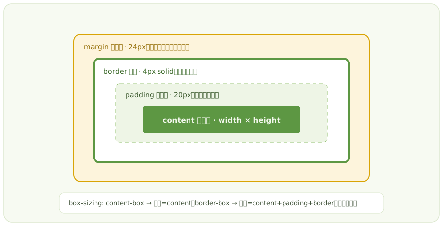
  1. 先看盒模型:宽高、padding、border、box-sizing。
  2. 再看定位上下文:position、transform、overflow。
  3. 检查 flex/grid 子项是否被 min-width 撑开。
  4. 移动端重点排查 viewport、图片宽度、表格溢出。

现代 CSS 使用边界与 fallback

:has()

适合父级根据子元素状态变化样式。旧浏览器需要 JS class 兜底,避免用于核心流程。

Container Query

适合组件级响应式。需要给容器声明 container-type,否则查询不生效。

Scroll-driven Animation

适合渐进增强。未支持时应保留普通 transition 或 IntersectionObserver 方案。

Masonry / Subgrid

兼容性仍需验证。生产环境建议准备 CSS Grid/Flex fallback。